The Shaws revamped a ’60s ranch home with an open-concept floor plan and vintage accents.
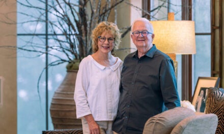
Gina and Steve Shaw were charmed by the overall look and location of the 1960s ranch home their realtor showed them two miles from their home in Hoover’s Lake Crest neighborhood in 2017, but they weren’t sold on the floor plan.
“It was really, really cute, but it wasn’t quite open enough,” Gina says. Later that night, their realtor, Sandra Williamson (Gina’s sister-in-law) was told the house had received three offers already, just in the first day it was on the market. Gina and Steve knew they had to act fast if they wanted to stand a chance in the contest for the house and its secluded one-acre location near Sulphur Springs Road.
“We didn’t even look at it again,” Gina says. “My husband said, ‘You want to do it?’ And I said, ‘Yeah, let’s do it.’ I loved it.”
The couple put in their offer and got the house in early 2017. Then, the real work started. They dove head-first into a 10-month remodeling project to remove walls and implement an open-concept floor plan in the main part of the house—the kitchen, den, living and dining rooms—and to add on to the master suite. They also added a large covered porch with an outdoor fireplace on the back of the house. With their two sons grown and gone, Gina and Steve were downsizing from their Lake Crest home and trying to maximize the spaces in which they spend the most time.
“We wanted to make the most of those rooms that we use. We felt like we were wasting a lot of space,” Gina says. “When we saw the house, we just kind of put our heads together on things we wanted. We drew our own plans up as to where we wanted to knock out walls and what we wanted to add. We agreed on most things, and we both had some good ideas.”
The couple adopted a rustic farmhouse style with light neutrals and vintage elements throughout the house. “I would like to think we did our version of a Joanna Gaines Fixer Upper,” Gina says. “It was a precious house before, and it was move-in ready, but we just wanted it more open. We love it.”
Steve says the home was “very tastefully done” when he and Gina bought it. They simply wanted to update and infuse it with their personal style. “We’ve had people ask who designed it, and I’ll have to say we just sat down and talked about what we wanted and began to draw it out,” he adds.
The Shaws plan to make this their final home. They’re still close to their church family at Hunter Street Baptist, and perhaps best of all, their grandchildren have grown extremely fond of the home. “This has become a little haven for our grandkids,” Steve says. “I’m approaching retirement and it’s good to get on one level and do something a little bit different while utilizing our own taste and ideas.”
• • •
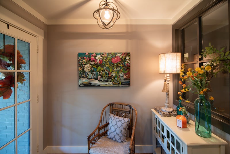
ENTRYWAY
The entryway sets the warm, cozy tone for the whole house. Gina convinced Steve to go along with her idea of installing a window in the wall separating the entryway from the hallway to give the space a more open feel without removing the wall.
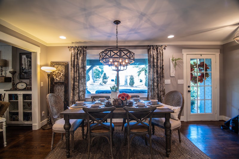
DINING ROOM
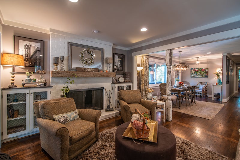
The Shaws removed a wall that divided what is now the dining room from the kitchen to create a more cohesive space. When they sit down for a meal with family members and friends in their dining room, they can still talk to anyone who might be standing in the kitchen or sitting on the barstools at the island. The view of their front yard through the picture window next to the dinner table is an added bonus.
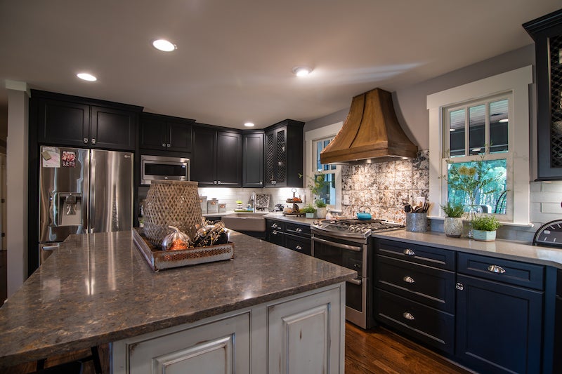
KITCHEN
Gina had no trouble choosing the color of the island, the focal point of the kitchen from the dining and living rooms. “Blue is my favorite color,” she says. She added some drama to the room with solid black cabinets from Brewer Cabinets, a copper range hood and a tile backsplash that pulls the entire room together with hints of copper, silver and blue. Long gray subway tile. The quartz countertops balance the black cabinets and blue island, and if you look closely, they boast a subtle shine with copper- and silver-colored flecks. “I absolutely love this kitchen. I actually like to cook in it,” she says with a laugh.
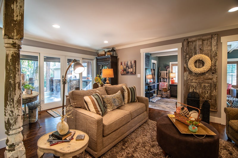
LIVING ROOM
Gina’s rule of thumb as she was choosing furniture, paint colors and interior accents was to buy what she and Steve liked, not just what’s trendy. To give the home a comfortable, rustic ambience, the couple bought old columns and doors from Southern Accents in Cullman. The columns were a natural fit between the living and dining rooms, and the doors hang or rest against walls throughout the main living spaces. They painted most of the walls Greige, a soothing gray-beige blend. “In my other house, I used a lot of darker colors,” Gina notes. “I still have some here and there. I just wanted to go with more airy, peaceful tones.”
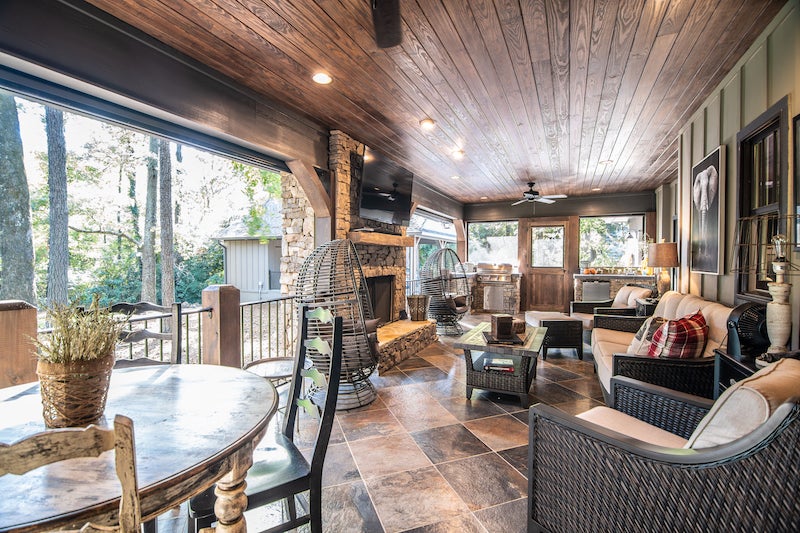
COVERED PORCH
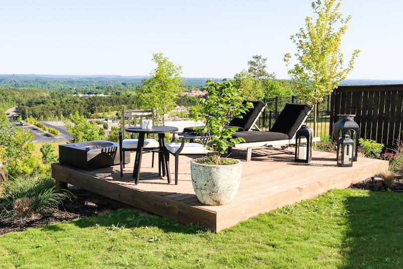
One of the highlights from the Shaws’ remodeling project was the covered porch they added to the back of the house. Steve needed a room where he could display his University of Alabama memorabilia, and also wanted a place to hang a big-screen TV and watch sports. “A guy’s got to have a man cave,” he says. Automatic screens can be lowered to convert the open porch to a screened porch. The porch overlooks the quiet backyard, an expanse of green grass bordered by bamboo trees.
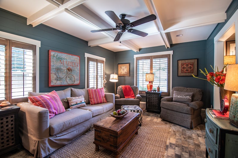
DEN
Gina and Steve installed two old doors from Southern Accents in the den leading into the mudroom. The den’s shiplap walls are covered in a bolder color than the rest of the house, but it’s balanced by the off-white beamed ceiling. “I had to have some color somewhere,” Gina says. Another feature that sets this rectangular space apart from the living room is the brick floor, a contrast in tone and texture from the wood floors throughout the rest of the house.
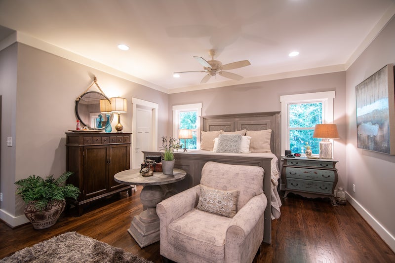
MASTER BEDROOM
Furniture, linens and décor in grays, creams and soft blues rest on the dark hardwood floors in the Shaws’ master bedroom.
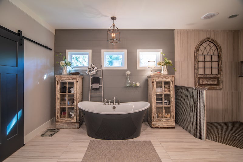
MASTER BATHROOM
The Shaws’ bathroom is an attractive combination of rustic and modern elements. Gina found the distressed cabinets on each side of the bathtub at Homewood Antiques. The subtle contrast in the gray shiplap wall behind the bathtub and the tiled walk-in shower creates visual interest.

GUEST BEDROOM
Gina filled the spare bedroom with more neutrals, from the bedspread to the nightstand to the dresser.
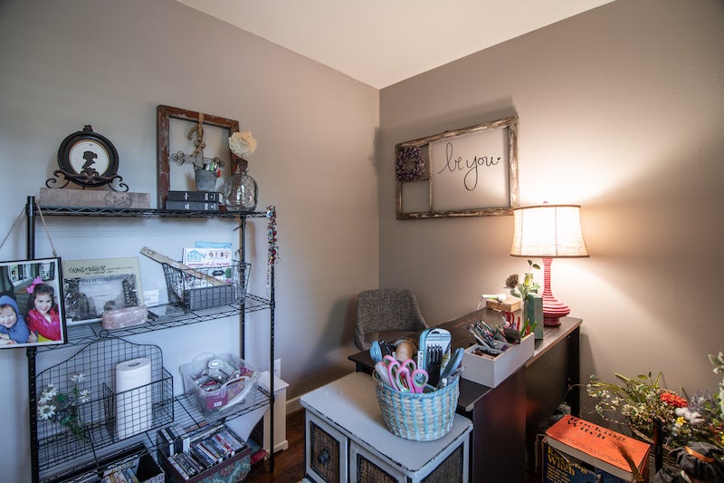
GINA’S CRAFT ROOM
Gina loves crafting and repurposing old items, so turning one of the home’s rooms into a room for her projects was an easy decision. “I’ve always loved to craft. It’s like my passion,” she says.
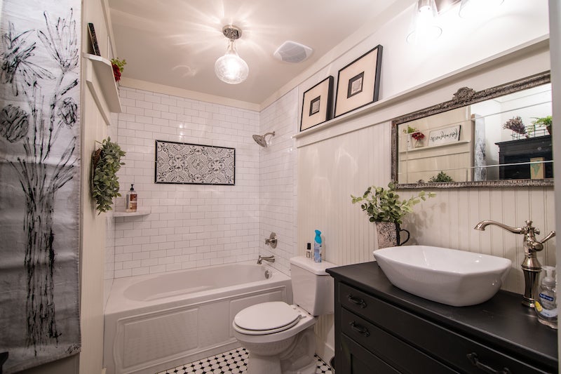
HALL BATHROOM
Dominated by black and white elements, this bathroom bears a clean and classic look. Gina deems it the perfect place for her mother’s black china cabinet, a piece “that’s really special to me.”
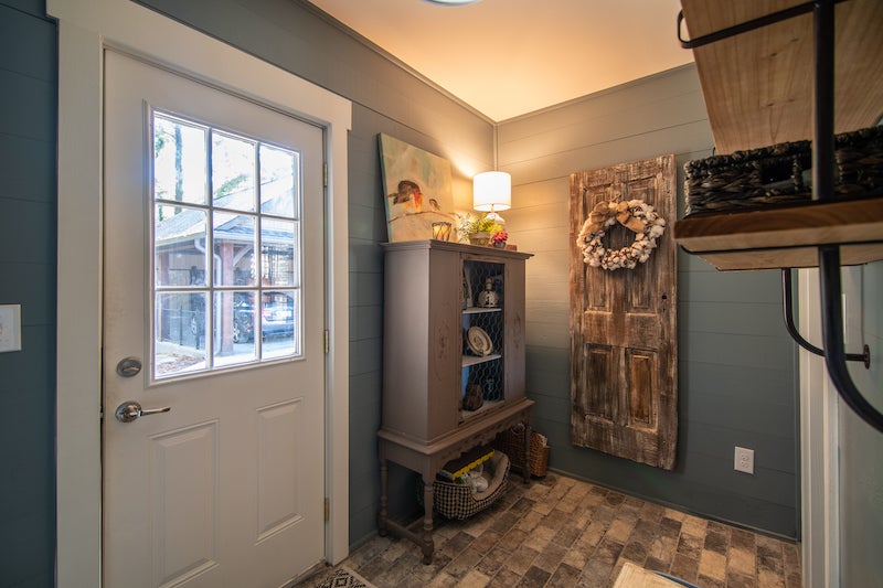
MUDROOM
It’s a small space the Shaws walk through when they’re going to or coming from their carport—another addition they implemented during remodeling—but they didn’t neglect the mudroom as they worked on the house. It bears the same brick floors and wall color as the den.
• • •
**BEHIND THE SCENES**
Construction: Mike Hood, H&H Construction
Construction Support: Ronald Shaw
Realtor: Sandra Williamson
Countertops, Backsplash and Bathroom Flooring: CR Home Alabama (selection assistance from Karen Isaminger)
Cabinets: Brewer Cabinets
Range Hood: Jimmy Wade, Wade Heating and Cooling
Landscaper: Blake Jones, Red Mountain Landscapes and Gardens

